Web Redesign for a Bedding Brand
2026
Web Design
Worked closely with cross-functional teams to define product direction and enhance user experience across key digital touchpoints, including checkout and product pages.
Applied up-to-date UX/UI trends and best practices to create intuitive, visually consistent, and user-centered design solutions.
E-commerce UX Improvement for a Bedding Brand
Website Redesign Project
Focusing on Conversion & Brand Identity Reinforcement
Checkout Page + Product Detail Page + Marketing Assets
Project Overview
The Background
Checkout Page + Product Detail Page + Marketing Assets
Key Objectives
1.
2.
3.
Main Scope of Redesign
Detail Page
1.
2.
3.
Checkout Page
Checkout Page + Product Detail Page + Marketing Assets
Marketing Assets
1.
2.
3.
FOCUS AREA 1
Project Detail Page
Objective: Improving brand value communication and optimizing user exploration efficiency
Marketing & Home Page

1
Hero Section
Utilized a large hero image with a clear “Shop Now” CTA to deliver the brand identity immediately upon first impression.
2
Product Grid
Implemented a card-based layout with top-level filters (All / Sport / Firm) to enable faster and more intuitive product discovery.

1
Trust & Story
Used the “Why Plasmabed” section to highlight key technologies, followed by customer reviews and certification badges to build credibility and trust.
2
Decision Support
Integrated “Compare Models” and a competitor comparison table to support in-page decision-making and reduce the need for external research.
Product Detail Page (PDP)

1
Visual Hierarchy
Structured the layout with a left-aligned product image slider and a fixed right panel for pricing, options, and CTAs to guide user attention and streamline the purchase flow.
2
Decision Support
Displayed estimated delivery details below the “Add to Cart” button and introduced installment pricing alongside the total cost to reduce uncertainty and lower purchase barriers for high-value products.
3
Offer & Add-ons
Presented bundle options using radio buttons to highlight included benefits and upgradeable sleep sets with clear visual icons, while featuring popular add-ons with “Add to Cart” actions to encourage seamless upselling without leaving the page.
Multi-step Checkout Journey
Checkout Page

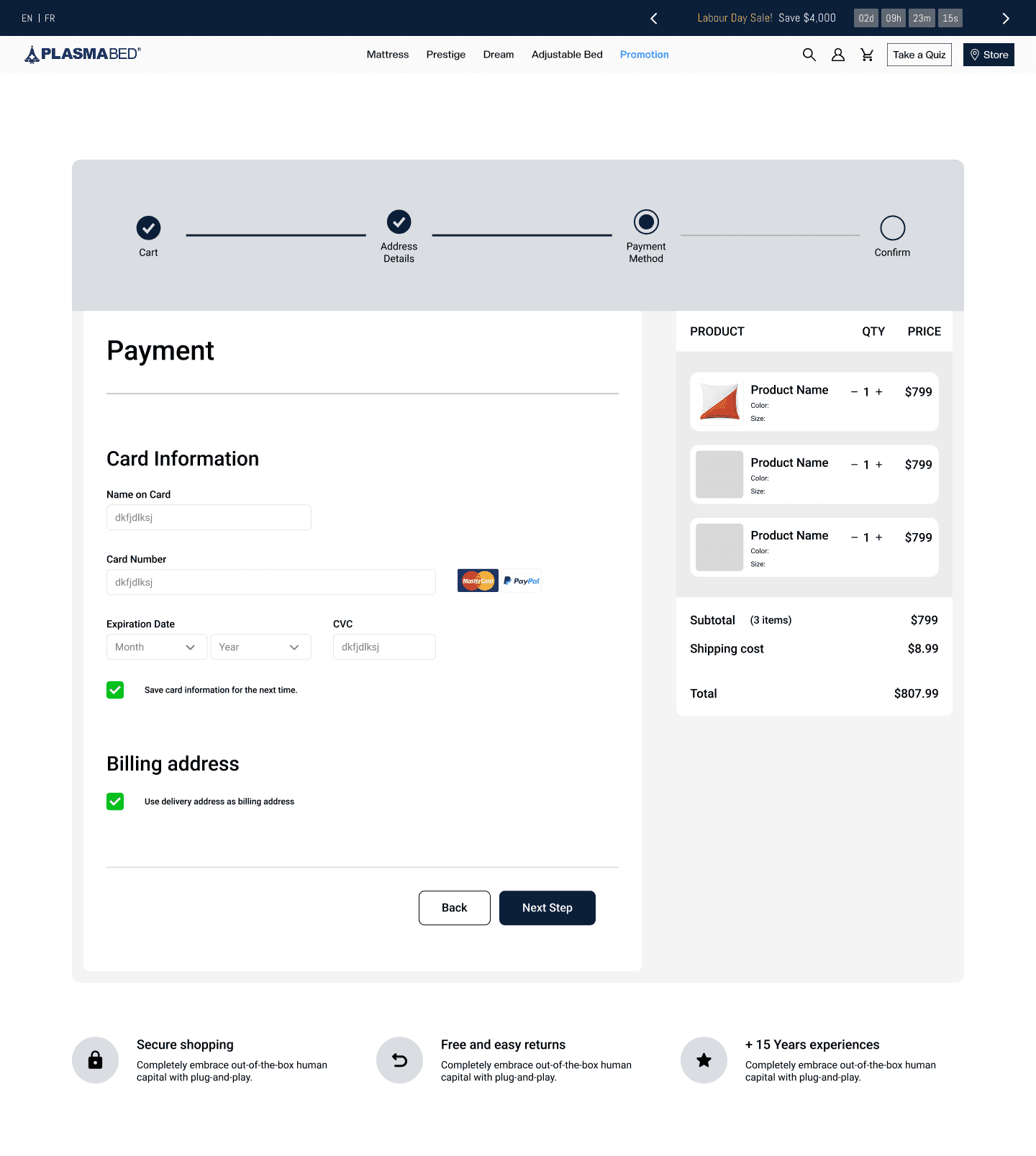

1
Streamlined Flow
Structured the layout with a left-aligned product image slider and a fixed right panel for pricing, options, and CTAs to guide user attention and streamline the purchase flow.
2
Order Summary
Displayed estimated delivery details below the “Add to Cart” button and introduced installment pricing alongside the total cost to reduce uncertainty and lower purchase barriers for high-value products.